Tiny Acts, Big Impact
Designing Kindness to Spark Everyday Goodness - Building for Social Good
Overview:
Tiny Acts was designed from the belief that small gestures can inspire meaningful change. It's a multi-platform experience that encourages reflection, connection, and gratitude through simple, everyday acts of kindness. Rather than chasing likes or followers, the app encourages authentic connection and mindful reflection. Users can also collect badges for their acts and download gratitude packs to stay inspired.Role:
Role: Sole UX/UI Designer (learning UX/UI while working full-time)Timeline: May 2025 - July 2025 (desktop, tablet, mobile, app)
Tools: Figma, Google Forms/Sheets/Docs/Slides
Problem Statement:
In a fast-paced world, many people want to do good but struggle to start or feel their actions won't matter. Most social platforms overlook positivity and reflection, while kindness apps often focus on large-scale efforts instead of small, meaningful acts.Solution
- To create a space that feels calm, sincere, and human—a place where kindness could grow quietly without the need to perform.
- Tiny Acts grounds users in gratitude and connection through reflective journaling, gentle prompts, and close circles of friends, transforming small acts into lasting habits of positivity.
User Research
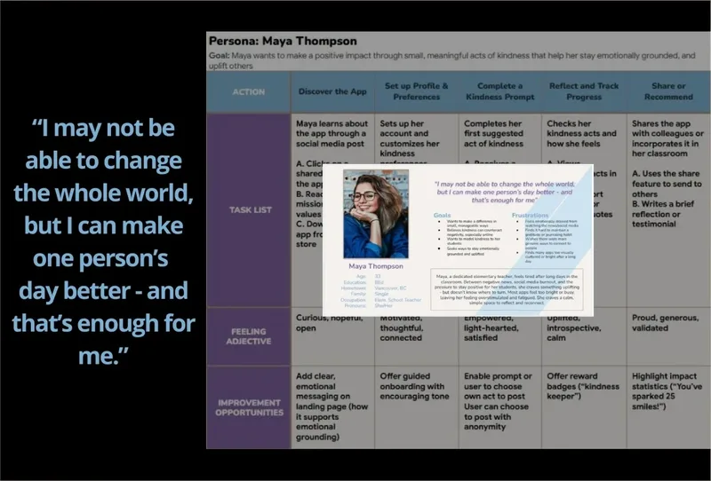
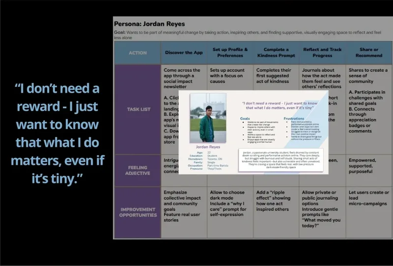
Due to project constraints, I conducted interviews with 2 participants and supplemented findings with a competitive audit and secondary research. Both participants expressed a desire for a calm, low-pressure space to practice kindness - motivated by personal growth and emotional balance rather than social validation. They wanted the freedom to choose how and whether they connected with others, and responded strongly to the idea of gentle visual feedback to reinforce habits.
What the Current Research Showed

Starting the Design
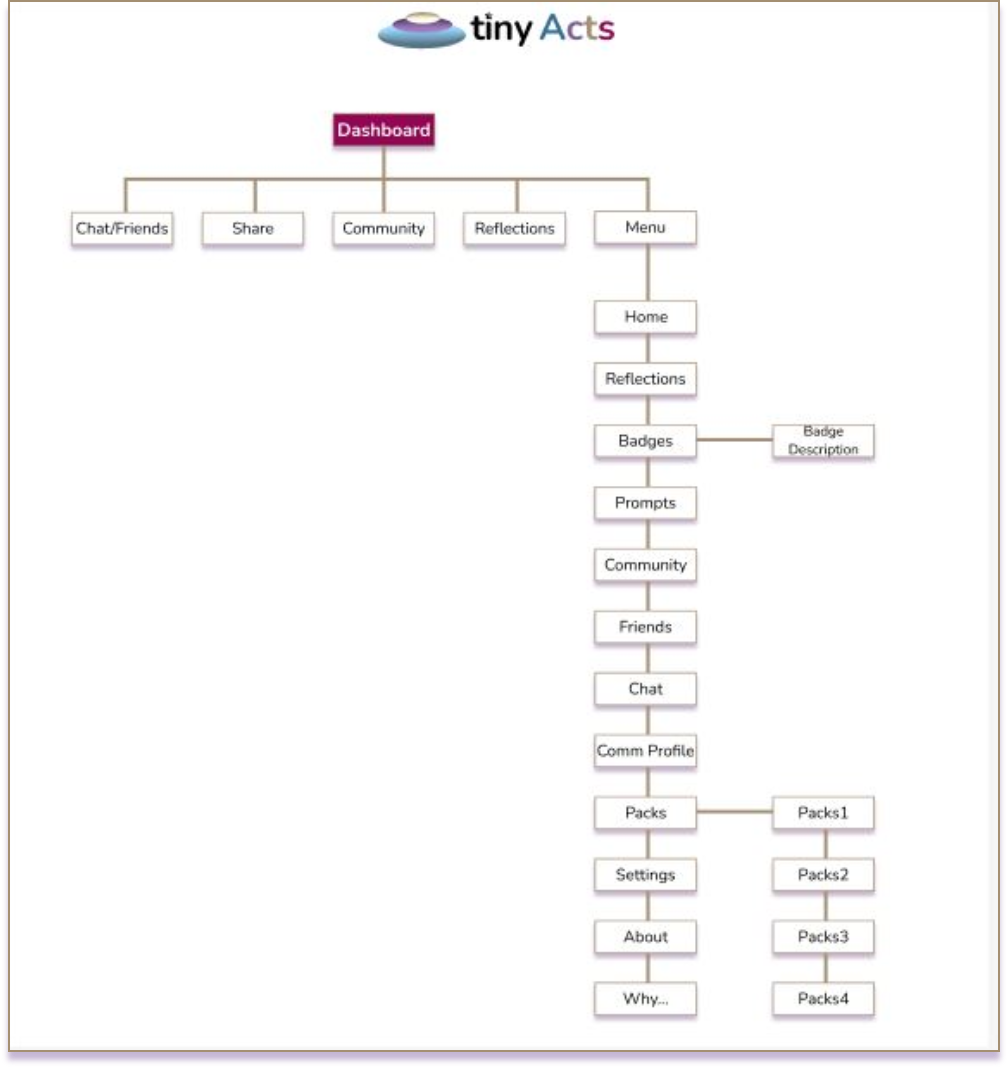
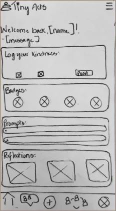
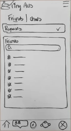
Guided by insights from my user personas and journey maps, I designed the sitemap and paper wireframes to create a clear, intuitive structure with minimal cognitive load. The layout prioritized ease of navigation and emphasized key needs like accessibility and flexibility for future growth.
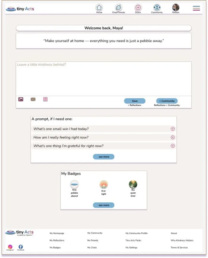
I envisioned a kindness-focused journaling app where users could reflect privately or share their acts within a supportive community. Early sketches featured a simple dashboard with recent badges, kindness prompts, and quick access to areas like Community, Friends & Chat, Reflections, and Tiny Acts Packs.
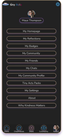
Every design decision—from including a button navigation bar for core sections to adding a hamburger menu for full access—was made to reduce friction and support both self-reflection and optional connection.
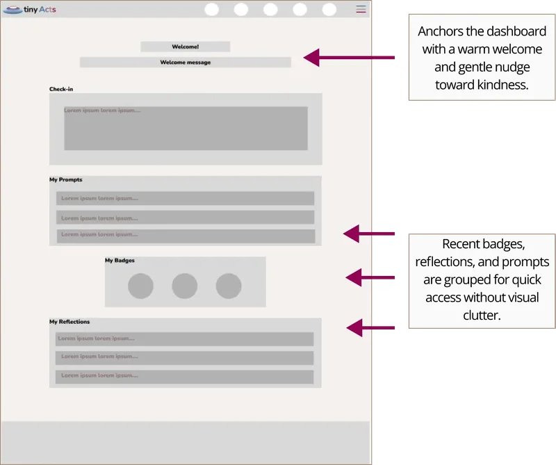
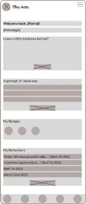
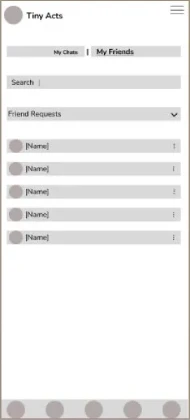
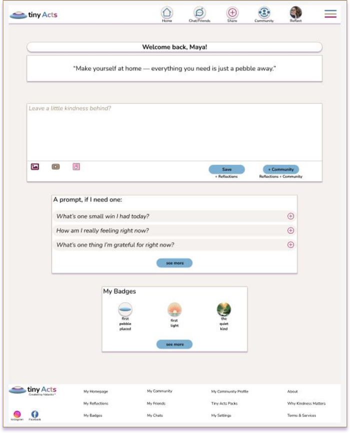
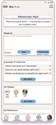
As I transitioned into digital wireframes, my goal was to bring emotional warmth and clarity to life across both mobile and desktop. The app homepage introduces a personalized dashboard that greets users and encourages small acts of kindness, while the Friends page highlights calm, intentional connection between users. The desktop homepage mirrors this warmth through clear hierarchy and whitespace, keeping navigation intuitive and consistent.
Usability Study: Findings
In the usability studies, I tested the prototype with participants to evaluate its functionality, clarity, and overall user experience. Key insights from the sessions revealed three critical areas for improvement:
Round 1 Findings

Participants

Users noted they initially weren't sure where some key features were located (like badges or
reflections). This
encouraged
Round 2 Findings
Users suggested
Participants expressed interest in being able to
Refining The Design
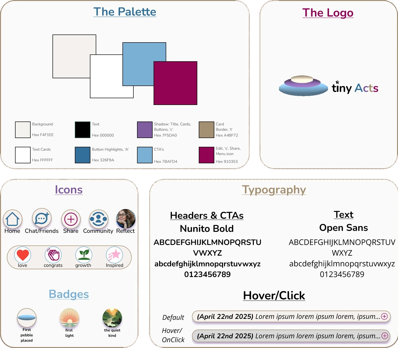
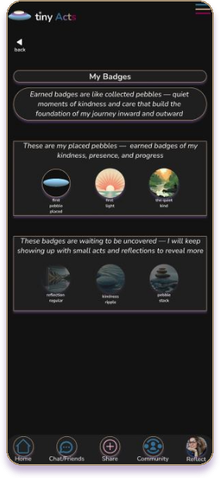
Refinements focused on strengthening emotional warmth while improving structure and usability. The Tiny Acts visual identity—anchored in a soft, warm colour palette—evokes optimism and sincerity. I chose Nunito for headers and calls to action for its rounded, friendly forms that convey approachability and encouragement. Open Sans was paired for body text to ensure clear readability across devices while maintaining a calm, balanced tone. Together, they create a visual rhythm that feels welcoming and sincere. The logo of three stacked pebbles symbolizes how small gestures create ripples of positive impact, a theme echoed in the badge system and rounded interface elements.
As the design evolved into high-fidelity prototypes, I enhanced the emotional tone through personalized messaging, subtle animations, and balanced whitespace. The desktop version expanded this calm rhythm, maintaining accessibility and warmth across all platforms. Each design choice reinforced the app's mission: to make kindness approachable, inclusive, and rewarding. I also introduced Tiny Acts Packs—downloadable, paid content designed as gentle, printable workbooks to help users slow down, reconnect, and practice kindness from the inside out. This addition extends the mission beyond the screen, blending digital mindfulness with tangible, real-world reflection.
Accessibility Considerations
Lessons Learned:
- Balance accessibility with aesthetic consistency across screens.
- The value of visual flexibility for user comfort and readability.
- How subtle interacts can increase engagement and delight.
- Small design decisions can deeply impact emotional tone.
Wins:
- Designed and prototyped both mobile and desktop versions with consistent usability.
- Created my first dark mode to improve accessibility and comfort.
- Used whitespace effectively to enhance clarity and focus.
- Created an introduction animation on all platforms, and carried forward engaging states throughout.
- Simplified social prompts to support emotional safety and inclusivity.
- Applied user feedback to refine flow and visual details.