Designing a Dynamic Museum Experience
Originally created for an assignment in my design program, this project evolved into a real-world opportunity. The museum invited me to refine and implement my designs for their website. See it live.
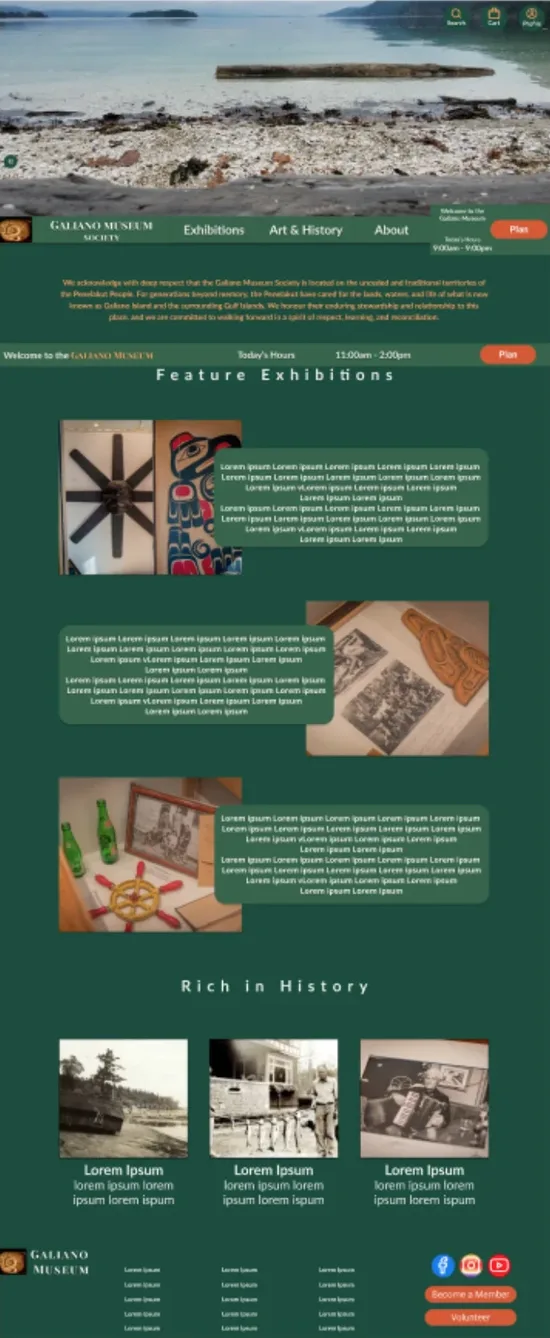
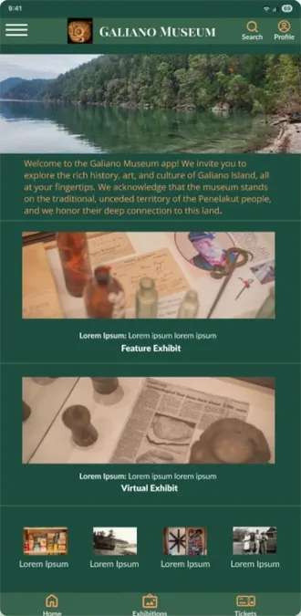
Overview:
This project focused on designing an intuitive experience for a public art museum, to enhance visitor engagement and accessibility. The goal was to create a seamless and user-friendly journey where patrons can explore exhibitions, access essential museum information, stay informed about events, and easily plan their visits--whether on mobile or desktop.Role:
Role: Sole UX/UI Designer (learning UX/UI while working full-time)Timeline: Nov. 2024 - May 2025 (desktop, mobile, app)
Tools: Figma, Google Forms/Sheets/Docs/Slides
Problem Statement:
What started as a course project became a real-world redesign when the museum invited me to adapt my concept for their live site. Their existing website offered little more than hours and a location — leaving visitors unable to discover exhibitions, find accessibility details, or understand what made the museum worth visiting.Solution:
- Designed a responsive website and mobile app addressing the museum's original challenges while evolving to meet real-world needs.
- Focused on showcasing exhibitions, simplifying visit planning, and improving accessibility for all users.
- Ensured the final design reflected the museum's heritage and offered a clear, engaging, and inclusive experience across all devices.
User Research
Due to project constraints, I conducted three rounds of interviews with participants across lo-fi, high-fidelity, and iterated high-fidelity stages, supplemented by a competitive audit of existing museum websites. Participants consistently struggled to find exhibition details, event schedules, and accessibility information — and expressed frustration that the existing site didn't reflect the richness of what the museum actually offered. These insights shaped the personas and journey maps below, and guided every major design decision through each iteration.
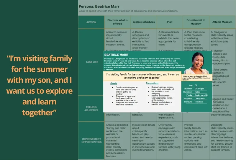
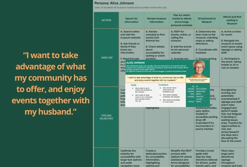
What the Current Research Showed

Starting the Design
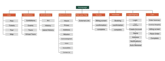
The sitemap was designed to create a clear, intuitive structure that supports easy navigation and highlights key user needs. I organized content to reduce cognitive load while making essential sections—like visiting details and accessibility—simple to find
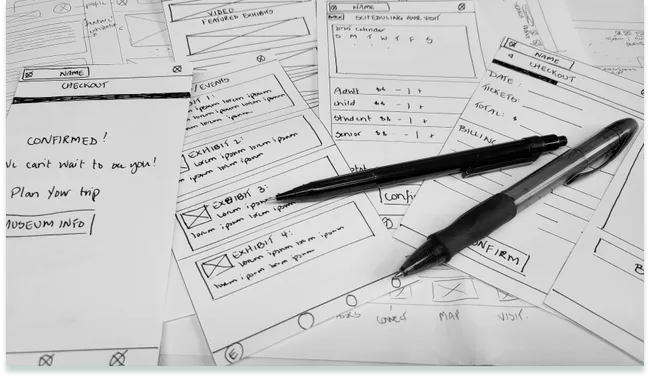
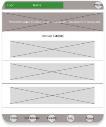
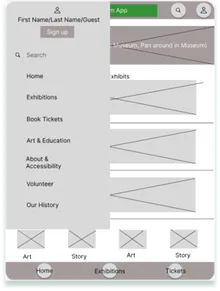
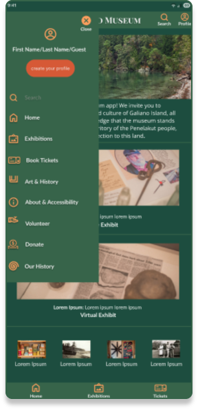
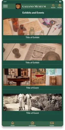
I began ideating with paper wireframes, focusing on a clean, simple interface that provided immediate access to key sections. This helped quickly test layout ideas and ensure usability across a diverse audience. Transitioning from paper to digital wireframes allowed me to emphasize accessibility and visual clarity. I made exhibition and history content easy to scroll through, added clear navigation, and included a sticky footer for quick access to Tickets, Plan, and Hours. Based on user feedback, I improved screen reader support, clarified exhibit descriptions, and made key actions more discoverable.
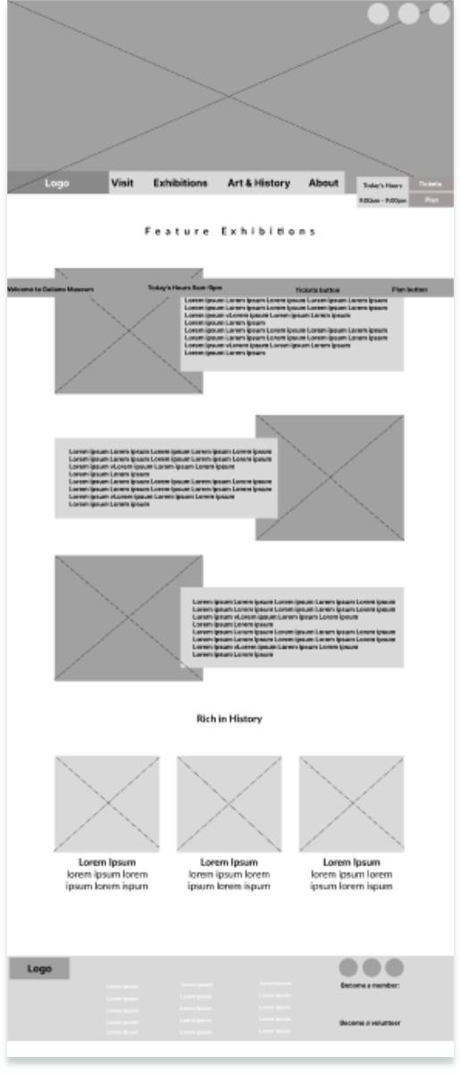
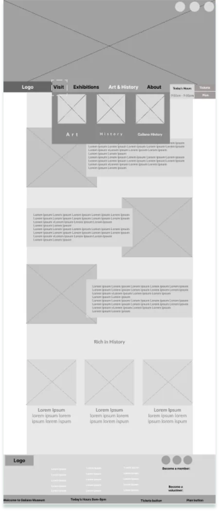
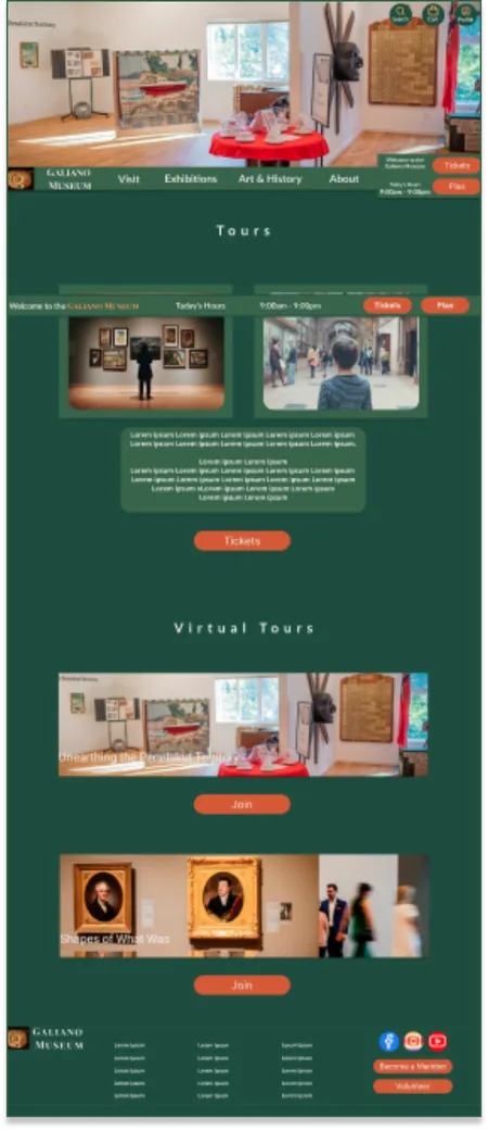
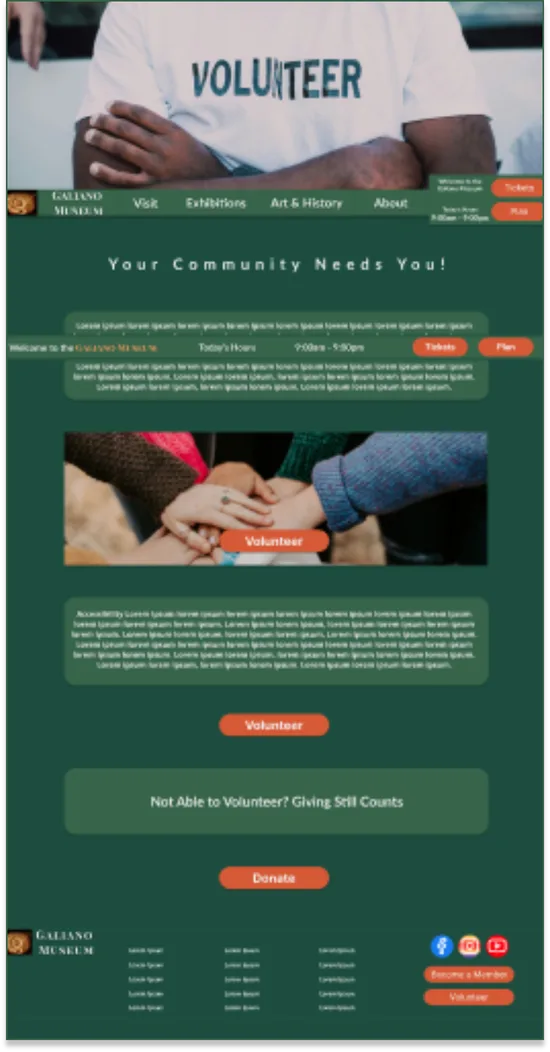
While maintaining consistency with the mobile app, I optimized the layout for larger screens. Key features like Tickets, Plan, and Hours were made visuall prominent and always accessible through a sticky navigation bar. The structure followed the sitemap I created, balancing clean organization with a natural flow between sections. My overall goal was to design a desktop experience that felt intuitive, inclusive, and effortless to navigate.
Usability Study: Findings
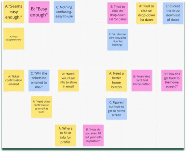
In the usability studies, I tested the prototype with participants to evaluate its functionality, clarity, and overall user experience. Key insights from the sessions revealed three critical areas for improvement:


Refining The Design
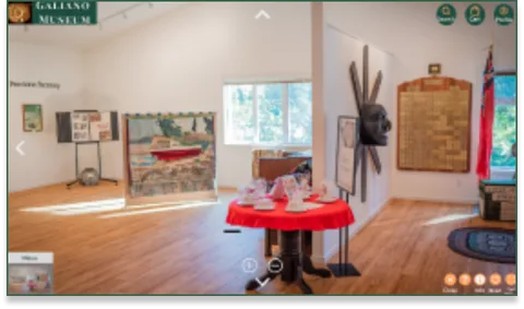
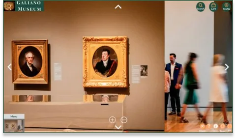
The visual direction was inspired by the locale's natural surroundings and the museum's heritage. A grounded palette of deep green and muted sage conveys growth and authenticity, while terracotta and soft orange accents add warmth and approachability. For typography, I paired Playfair Display SC for titles with Open Sans for body text to balance elegance and readability. Lato Bold was used for headers and CTAs, providing hierarchy and contrast. The icon system features clean, recognizable line icons that enhance navigation and support accessibility while maintaining a cohesive aesthetic.
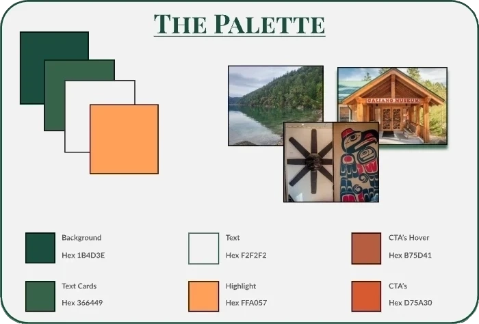
These visual elements were carried into the high-fidelity mockups for both mobile and desktop. Feedback from a museum board member helped refine event and volunteer features, ensuring the final design felt both engaging and practical. The result is a seamless, welcoming experience that reflects the museum's story and prioritizes usability across all devices.
Accessibility Considerations


Lessons Learned:
- How to balance aesthetics with functionality to create a seamless user experience.
- Deepened my understanding of accessibility and inclusive design principles.
- Found that starting with paper wireframes helped quickly test and validate layout ideas.
- Discovered how continuous feedback strengthened my overall design approach.
Wins:
- Developed a cohesive design system and responsive layouts that created a unified experience across app and web.
- Crafted a colour palette and visual direction that earned approval from the Museum Board.
- Applied accessibility best practices that enhanced usability and inclusivity.
- strengthened my proficiency in Figma through the use of components, auto layout, and design libraries.